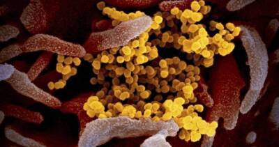
'Horrifying' animated map shows Covid-19's deadly eight-month takeover of UK
coronavirus swept across the UK over the last eight months. The animation, posted to Reddit by user _c9s_, shows the number of positive Covid-19 cases confirmed across the UK (and the Isle of Man) from the beginning of February up until October 9.The graphic is colour-coded from white to red to black to show the number of cases per million people.Cases were taken for each lower-tier local authority area per day of the pandemic, adjusted for the population of the area.The date is shown at the bottom of the gif and reveals how quickly the deadly disease surged across Britain, with some regions going from pale red to black in the space of a matter of days.London, the centre of the UK's epidemic earlier in the year, gets its own mini inset map.
Read more on dailystar.co.uk


United States
|
Cases: 46 252 513
Deaths: 750 423
Recovered: 0
|

India
|
Cases: 34 321 025
Deaths: 459 652
Recovered: 0
|

Brazil
|
Cases: 21 835 785
Deaths: 608 235
Recovered: 0
|

United Kingdom
|
Cases: 9 215 683
Deaths: 141 607
Recovered: 0
|

Russia
|
Cases: 8 494 589
Deaths: 237 619
Recovered: 0
|